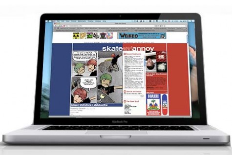
Out with the old.
You might have noticed I haven’t been updating as frequently as usual for a the past couple of weeks. It’s because I’ve been swamped with things in the real world, and I’ve been spending a lot of my S&A time tinkering with a redesign. I got sick of looking at the old site. It had hadn’t changed considerably since 2006 when I launched the blog part of the site. The old look was cobbled together as I went along. It wasn’t really meant to be long term, but things got away from me and it was “good enough.” I almost went with a prepackaged theme, but that would have been too easy. This new one is a work in progress, you’ll notice a lot of missing items that will start to reappear in the next week or so. Some details may change from day to day for a while too. Eventually all the static pages will be brought into the new look as well, but for now it’s still legacy. I’ve got a few little gimmicks I’m considering, like I might make some adjustments under the hood to allow you to chose from a couple different theme variations, including “Skate and Annoy Classic” as it will be named from now on. Hopefully this isn’t the “New Coke” version of S&A. I look forward to your feedback, positive or negative, as long as it’s constructive. I’m interested in finding out if it looks like crap in your broswer. If it looks buggered, please send in a screen shot and let me know what browser version you are using, and whether you are on a Mac like all good hearted people or a PC. If you are still using Internet Explorer you’ll miss out on some minor eye candy. For the love of Thor, try Firefox or Safari like the rest of us. Please, it’s the civilized thing to do. I hope you enjoy!

I can dig it.
I like this much more. Good job dude.
Very nice layout! I really dig the vertical bar with the S&A logo on the side.
Not sure if I like the chopped topic titles though. Legibility is a little tough.
Chopped topic tiles? I don’t understand what you mean. Are you talking about the Tag Cloud?
The name of each post like “Out with the Old” and “He does all his own stunts” were cut in half and you only see the top part of the letters. Now you can see the entire post name. Much more legible.
Since we are on the topic of change, I’d like to get rid of the fruit booter logo.
I’ve got my gravatr avatar but I can’t get it working on SNA. When I click on the link it tells me” Whoops! Something went wrong!” What’s up?
http://en.gravatar.com/accounts/activate/scumskates%40me.com/37fb69b3a6
Not sure KC. I think Neil was having the same problem. I’ll look into it, but you might wan to fill out that error report that comes up.
looks alright i s’pose…:/
Thanks!A new layout for my birthday.I’m on Safari.It all looks good to me.
35;I feel like an old man for the first time.Can’t think of a better reason to start skating again.
Looks good on my Blackberry and loads fast. Now I can read S&A faster while not skating my local spots.
Why isn’t “Dan Gesmer” in the Tag Cloud? Oh, everything looks good to me. I’ve been surfing with Safari since Christmas.
Looks Great dude !
Great – it is the great spring renewal.
+++
Works in Chrome. Looks good. I will say I like a solid background though. For the other cent of my two cents, I’d leave the black bars on the side expanded.
…cept for the “Categories..” and “Tag Cloud”
I like the clean look…but it is kinda boring. Vanilla anyone?
I dig it.
Have I reached some sort of Daddy yo status for still using explorer? How would you know this? Anyways I like the changes even with explorer.
the diagonal bars don’t look good. could use more color. but i was a big fan of the old look. i’ll try n give it some time tho.
I can see that, I wasn’t sure I liked it at first, made 11 different patterns. I’m going to work on giving people the option of choosing their own backgrounds.
I’m using IE 7 and all looks OK. Not sure about any missing eye candy. Also don’t see the BFF links as that’s how I used to get to Rich and Mark’s sites. Work in progress?… looks good so far.
BTW, I clicked on “none of your business” a chose SnA 2.5. How do I get it back to 3.0?
Oops! You shouldn’t have been able to see that. Should be back to normal now.
Missing IE eye candy. a little drop shadow around the white boxes.
Looks great Randy!
The background reminds me of the sleazy salesman type in Warner Brothers cartoons who had the plaid suit with the pattern that stayed static. He would walk and the plaid would just move through him. It was funny as shit.
The plaid suit moved through him. I remember that. Yesterday’s background did look a little corporate, like a shiny tie. Today’s looks better, like a scotch tape job. A scrappy looking background (xeorox chic) might be more in keeping with the theme you have going here. Didn’t this site come out of a zine?
Naw,a real scotch tape job would look like the Noodles (Offspring) Ibanez signature guitar…
That concrete sidewalk background is pretty cool! Unique
I can’t seem to find a recent, approx. within last month, post on the upcoming West Linn park slalom race. ???
i have a hard time adjusting to change . will see in a month. getting old.
it’s lookin good. lookin better. i did like the big Skate & Annoy bit that ran across the top of the page. reminded me where i was and what i was put on this Earth for…now i have to look over at the side, and it kinda looks like Skate, Fuck! & Annoy. i guess that’s not too bad either tho.
The ad at the top kinda bums my eye flow. I guess I expect to see main nav items there instead of on the left side. LOVE the background and the minimal color scheme. Drop shadows on the content areas seem a bit overdone. I am new to S&A, so I’m not familiar with the old site. Overall, the site looks nice and the content ROCKS.
[…] love it or not, it’s here to stay for while. I think the last redesign was in 2010. Please feel free to leave (constructive) criticism as well as bug reports, and pardon […]