
Jim Phillips
Schiffer Pubishing
Copyright Date: 2004
Review Date: 2004
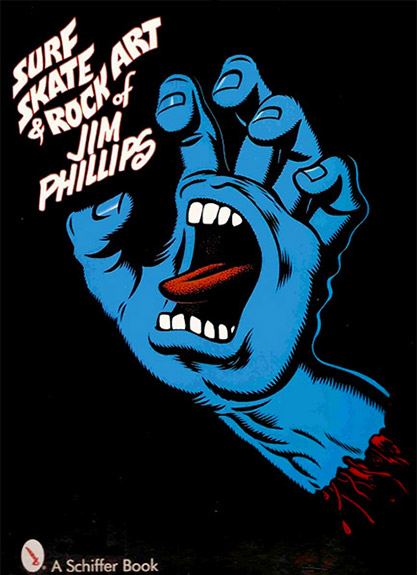
During its’ heyday in the 80’s, Santa Cruz always had a certain style of art that gave the company a distinct and unified presence. Even if you didn’t ride the boards you could still appreciate the completeness of their image. Most of this, it appears was due to the illustrative work of Jim Phillips. Phillips birthed such icons as the Screaming Hand logo and the slasher graphic. The Surf, Skate & Rock Art of Jim Phillips chronicles Jims’ art career from grade school student to commercial illustrator to fine artist, and all points in between. Rock and Roll posters, motorcycle catalog illustrations, Christian comic book illustrations, product ID, editorial cartoons, and auto detailing are all among the examples you’ll find in spades. What is particularly interesting is seeing the progression from 60’s and 70’s surfer/hippie art to the starker images made popular in the neon 80’s world of skate punks, a culture that typically had little regard for mellow hippies and their ilk.
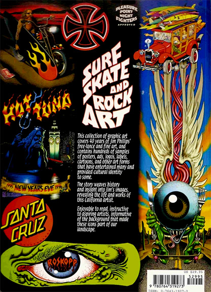
As far as the skate word goes, Phillips is responsible for shaping the collective subconscious of the industry as we know it today. He started in the late seventies and the very distinctive OJ and Road Riders graphics as well as the grand daddy of ubiquity, the Independent Trucks logo. The early eighties reveal the Santa Cruz red dot logo (which should never have been abandoned) and later lead to such notables as The Slasher, Screaming Hand, an dthe Roskopp series, all of which are shown in progression. Bullets, Slimeballs, Rip Grip, Cell Blocks? If you skated at all in the 80’s it’s a safe bet that you can remember what all or most of them look like. Looking at the pages of ad campaigns and collected logos and board graphics is like looking at one of those giant gumball machines at a toy store. The color pallet may be the same, but unlike the cheap gumballs, Phillips’s art doesn’t lose its flavor after a couple of minutes. While a lot of his skate art is super clean and cartoon like, Jim also has a talent for more detailed work like Jason Jesses’ famed Neptune graphic, Corey Obrien’s flaming Grim Reaper, Salba’s Tigers, and Grosso’s Atomic bat… You remember them all.
Don’t buy this book expecting it to be a complete Santa Cruz retrospective. Phillips had a career well before that, illustrating tons of hippie and acid rock concert promotions, bible comic tracts, and other advertising work. The Surf, Skate & Rock Art of Jim Phillips is peppered with interviews, recollections and background information on Jim Phillips. The book focuses on these elements as much as the skateboarding, which may bum out those who are only interested in skateboard nostalgia. In fact, my only criticism of the book is that it isn’t fatter. I would have liked to see a larger reprint of most if not all of his deck designs. In any case, it’s a fat, colorful and unique anthology that spans a very interesting career whose influence can not be denied. Visit jimphillips.com to go right to the source. .
208 pages perfect bound. – $29.95
Online Action: schifferbooks.com
Online Action: jimphillips.com
No Tech: Schiffer Pubishing LTD 4880 Lower Valley Road, Atglen PA 19310
Recent Comments