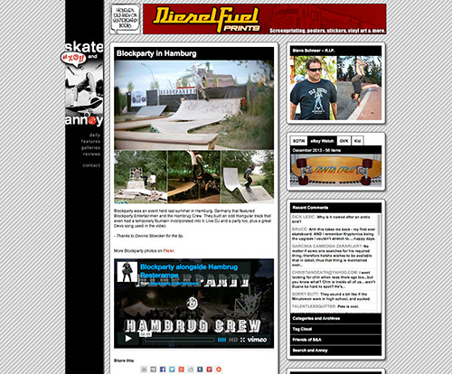
Whoo boy! So I’ve been busy in my free time since the winter holidays, working on the redesign of Skate And Annoy. It’s not quite done yet, but I’m getting sick of turning it on “maintenance mode” at night and weekends while I work on this. There are definitely a few bugs and some things that are not working too well, like the top navigation drop downs, which looks about as nice as a Nash Executioner. I’m embarrassed about them right now, actually. Also, for those of you on iPads and iPhones, I haven’t gotten to the responsive design layout yet, but it is definitely a priority. The biggest chunk of the work was in the back end, consolidating 4 themes, stylesheets and templates that were often redundant and were getting a little bit out of control. Speaking of css style sheets, don’t look at this one yet… At some point I got tired of managing it during development so I just started tacking things on at the end. It will be cleaned up and minified for faster downloads. What, doesn’t everyone who reads this site write their own php/html/css?
So love it or not, it’s here to stay for while. I think the last redesign was in 2010. Please feel free to leave (constructive) criticism as well as bug reports, and pardon our dust as construction continues.


15 comments
Watches
That is very attention-grabbing, You’re a very skilled blogger. I’ve joined your rss feed and sit up for searching for more of your wonderful post. Additionally, I’ve shared your web site in my social networks
Dale
Off to a good start. Different browsers render fonts differently (you know that), so don’t forget to preview a few before committing your changes. the font in Chrome looks busted up, but looks fine in FF.
Kilwag
That’s ironic since it’s a Google font, using google’s own embedding code, and I did check it in chrome. What computer OS are you on?
CS
And I thought this was a XXX site….
orezona
Kilwag: Very nice work!
For those freaking out: You’ll get over it.
talentlessquitter
Alright, it’s very neat and I just have to get used to it.
One more thing (‘Yes, Lieutenant Kilombo?’): I can barely distinguish the bloodred letters (the links) from the black ones. A bit of a rookie mistake if you ask me. No offense! Maybe it’s also because of the thin font.
Kilwag
The contrast was higher before I made the body copy darker… It’s like a see-saw. Then again it maybe your monitor sucks. 🙂
talentlessquitter
Fair enough.
I’ll shut up now.
Kilwag
Looks like it’s inserting an extra blank paragraph tag in the top posts. I’ll fix that tonight.
dylan digits
It looks very clean! My only request is that you consider increasing the contrast between body text and background; I find it hard to read.
Kilwag
You might be right. I’ve adjusted it. How is it now?
dylan digits
The contrast helps, definitely. Thanks for that. talentlesssquitter mentioned the thinness of the font being a possible problem and I think that’s true; I find my eyes being drawn to the images in the right-side column and background as I try to read the text in the center. Slightly heaver font weight and/or darker text still could fix it.
Kilwag
I’m reminded of “If everything is important, than nothing is important.” I will continue to fine tune. I appreciate the feedback. It is hard for text to compete against images.
Bevilacqua
Clear & clean. Thumbs up !
talentlessquitter
Heeey ….
You didn’t announce a thing. Where is my favorite website?!?!?