Which do you prefer?
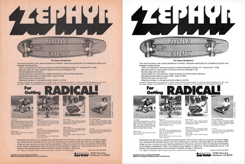
I’m trying to decide how much retouching and color correcting to tackle in the Vintage Skateboard Magazine Advert Gallery. Here’s a comparison for this Zephyr skateboards ad from 1975. Not surprisingly, the forty year old pages are discolored with age. Do you prefer the scanned image with minimal color correction, or the adjusted version that is closer to what the page originally looked like but has a slightly artificial look to it? There’s an enlargement to compare after the jump, but really this is just an excuse to get you to check out Zephyr Skateboards: Young dudes in heavy spots.
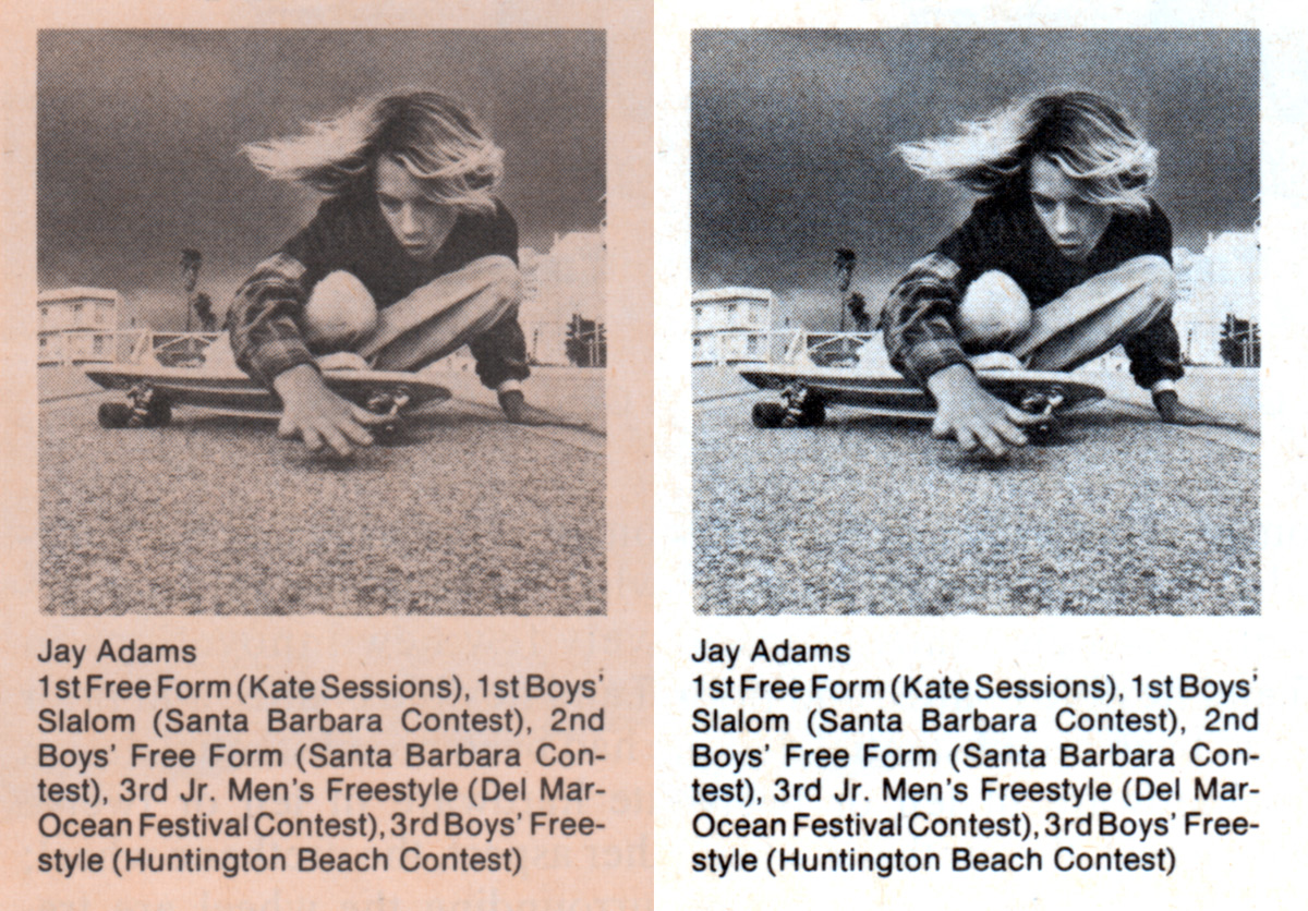
View the full sized ad with details and ad copy.


Minimal correction for the ads and souped-up for close-ups, I guess?
honestly, when i find an old scanned skate photo i like that is discolored, i color correct it myself before saving it to my computer.
I would color correct them.
Paper was originally white. Restore it.
Agreed. Fix it.